Home Tones: Hibiscus

Hibiscus pink games roomcredit

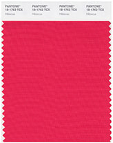
Last week, in our Home Tones post, we discovered that my birthday colour is Dry Rose. This week, it’s only fair to talk about Justin’s birthday colour – Hibiscus – which is your colour if you were born on 14th April. If you weren’t born on this day, you can find out what your own colour is in Michele Bernhardt’s book, Colorstrology: What Your Birthday Color Says About You.

Those born on Justin’s birthday are supposed to be, “Determined | Persuasive | Sparkly”. It continues…

Swatch of Pantone's 'Hibiscus'You have a sparkly personality and the room lights up when you are in it. It is important for you to express your ideas with flair and gusto. Staying within the status quo and being average is not for you. Remain detached in regard to material ambitions and you will find that money and financial gain will come more readily to you. Your personal color gives you the staying power to follow through to completion. Wearing, meditating or surrounding yourself with Hibiscus helps you to listen better while improving your timing.

Dressing room with chair upholstered in hibiscus pink fabriccredit

Hibiscus pink, black & white bathroomcredit

Hibiscus pink decorated twin bedroomcredit

Sitting room decorated in hibiscus pink and white with turquoise upholstered armchairscredit

White bathroom with hibiscus pink painted feature wallcredit

White painted four poster bed with hibiscus pink headboard, cushions and blanketcredit

Glossy hibiscus pink and white fitted kitchen cabinetscredit

Home Tones: Sharkskin

'Home Tones' blog post banner

Sharkskin contemporary staircasecredit

This week saw Pantone publish their top ten colours for autumn 2016. Of the ten, sharkskin is our favourite. Pantone may have been talking about fashion trends, but doesn’t the colour look fantastic in interior décor too?

It’s such a versatile shade, working well in any room of the house – and outdoors too. Use it as a backdrop to brights such as acid yellows and greens, violet, tangerine and aquamarine. Go monochrome with other shades of grey – or combine with the natural tones of wood and wicker.

Kitchen with sharkskin grey painted wallscredit

Bathroom with sharkskin grey floor to ceiling ceramic tilescredit

Sharkskin grey upholstered sofa on bright & airy sitting roomcredit

Grey painted kitchen with black Agacredit

Bedroom with grey walls and water hyacinth woven matcredit

Grey minimalist kitchen with breakfast barcredit

Home Tones: Green Flash

'Home Tones' blog post banner

cottage entrance with green flash front door

credit

Whatever happens in the fashion world filters down into the interiors world. The following is what Pantone had to say about Green Flash, one of the top 10 fashion colours they picked for spring 2016.

Green Flash calls on its wearer to explore, push the envelope and escape the mundane, radiating an openness that combines with the rest of the palette in unexpected but serendipitous ways. The popularity of this brilliant hue is representative of nature’s persistent influence even in urban environments, a trend continuing to inspire designers.

Perhaps not the easiest colour to use (nor wear for that matter), but it is very striking when successful. It’s fresh & clean so perfect for bathrooms – and also looks great near large windows where it helps bring the outdoors in. The ideal partner is a crisp, contrasting brilliant white.

modern kitchen with green flash splashbackcredit

white chest of drawers in front of a green flash painted wallcredit

Kid's bedroom with green flash painted wallcredit

kitchen diner with green flash coloured tile splashback and feature wallcredit

shower room with green flash pained and tiled walls and ceilingcredit

green flash painted porch and wooden railingscredit

bedroom bay window with green flash painted wallscredit

Home Tones: Rose Quartz and Serenity

'Home Tones' blog post banner

Armchairs and cushions in Pantone's 'Serenity' colour of the year 2016credit

In the past week, ‘Rose Quartz’ and ‘Serenity’ have been chosen as the joint Pantone Colours of the Year for 2016. We’ve chosen to highlight various homes that use the two colours. Personally speaking, we’re not keen on using them together – it’s a bit reminiscent of 1980s coach seat upholstery.

They’re colours we think would be used to paint the walls in babies’ rooms – a little uninspiring – pink for girls, blue for boys. We have however found some interiors that use them successfully.

Scandi living room with pink painted mid-century modern chairscredit

Shower cubicle in a Victorian barthroom with Serenity painted wallscredit

Pink painted filing cabinet in a home officecredit

Harvey Jones kitchen with Serenity coloured central islandcredit

Rose-quartz kitchen countertopcredit

Serenity painted bathroomcredit

Rose quartz painted panelled wall with blue bed linen and headboard
credit