
Sometimes you look at the exterior of a house and just know you’re going to like the interior. It doesn’t work out 100% of the time, but this is one of those occasions that it does. Perhaps you could say that it even exceeds expectations, we love it so much.
The house belongs to Jo Weeks who owns interiors shop, Sixty Seven – and is featured in the May 2016 edition of Country Living magazine. I’m sure wouldn’t want to take all the credit as the house was bought and refurbished by Alex Legendre and Zoe Ellison who also own a homewares shop, I gigi. Jo had the wonderful luxury of moving in after all the hassle and dirty work was over – bliss!
The house is situated in the North Laine area of Brighton – a place we know well. We’ve spent many an hour wandering round the North Laine (or North Laines as most people call them now) – browsing the shops, eating lunch and drinking in the many watering holes. In fact, Justin used to own a house there too twenty years ago. We wonder which street this one’s on.
We know one thing for sure – we absolutely love what they’ve done with the place – as they say. A lesson in creating a modern home whilst retaining character and atmosphere in bucket-loads.
The colour palette is restful, but never dull. There are many layers of natural tone – and a pared back simplicity which allows spaces to breathe. In fact, there’s real discipline shown so as not to clutter or overcrowd. As the feature title says, “Where less is more”.
Many generations have called it home – and there’s a real sense of history and intimacy. Jo is now making it her own much loved family home.
Usually, when you read a house tour something irks you a bit – the odd piece of furniture placement, a certain colour, a decorative object. We’ve had a good look – no, there’s nothing.
Rooms appear light and airy. They’re filled with some lovely vintage furniture such as the kitchen seating, the writing desk and the very comfy looking leather club chair. Where a contemporary piece is needed, such as the cream wood burning stove, it’s the perfect choice. Decoration is simple with fresh flowers and the occasional painting (which, surprise, surprise – we love too!). We wonder who the artist is? It’s very much like the landscapes of an artist we know called Geoffrey Key. We had to sell our Geoff Key oil painting to pay for a major operation on our dog’s leg – are you listening Fudge? :-).
We know from experience that big gardens just don’t exist in the North Laine, but most houses have a small courtyard space. With a bit of creativity, these can be lovely little havens too. Here, the whitewashed space with with overhanging vine and tempting looking chairs offer the perfect spot for an evening G&T or glass of wine. When can we move in?!


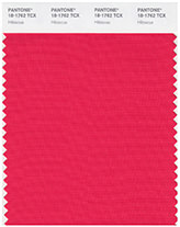 You have a sparkly personality and the room lights up when you are in it. It is important for you to express your ideas with flair and gusto. Staying within the status quo and being average is not for you. Remain detached in regard to material ambitions and you will find that money and financial gain will come more readily to you. Your personal color gives you the staying power to follow through to completion. Wearing, meditating or surrounding yourself with Hibiscus helps you to listen better while improving your timing.


